What I learned
Crafting Olive was a profound learning journey:
Understanding User Needs: Acknowledging the diverse needs of healthcare service seekers is pivotal. Conducting comprehensive user research and soliciting feedback throughout the development journey ensures that the app aligns with user expectations.
User Interface Design: Formulating a user-friendly interface that seamlessly incorporates medical information, appointment scheduling, and patient records presents a considerable challenge. Striking a balance between presenting intricate data and ensuring intuitive navigation and visual clarity is crucial for usability and user satisfaction.
Accuracy and Reliability: Upholding the precision and dependability of medical information, appointment schedules, and patient data is paramount. Regular updates, stringent data validation processes, and robust error handling mechanisms are vital for preserving data integrity and fostering user trust.
Accessibility and Inclusivity: Constructing the app with accessibility and inclusivity at its core guarantees usability for a diverse spectrum of users, including those with disabilities or special requirements. Integrating features such as voice commands, screen reader compatibility, and adjustable font sizes enhances accessibility.
Continuous Improvement: Embracing a culture of continual enhancement through user feedback, data analysis, and iterative design processes is imperative for sustained success. Consistent updates, feature refinements, and bug fixes driven by user insights and market dynamics keep the app pertinent and competitive.
In essence, developing Olive demanded a multidisciplinary approach, blending expertise in user experience design, data integration, and community engagement to deliver a compelling and enriching user journey.
Going Forward
Given the opportunity and additional time in the future, I aspire to conduct further usability tests to fine-tune both the features and UI design. Moreover, I aim to extend the app's compatibility to Android phones and desktop browsers, tailoring the design accordingly. Ultimately, I envision bringing this app to fruition in the real world, collaborating with a seasoned developer team to ensure its successful implementation.
Thank you for reading my case study!
UI Elements
Typography
Copy/Language Guidelines
Icons
Buttons
Navigation Bar
Input Fields
#D5EDF2
#E5E5E5
#02CACD
#F2F2F2
#BBBBBB
Olive Style Guide
Color Palette





Title 1 - Red Hat Display - Bold / 26pt
Title 2 - Red Hat Display - Normal / 20pt
Heading 1 - Red Hat Display - Normal / 16pt
Heading 2 - Red Hat Display - Normal / 14pt
Heading 3 - Red Hat Display - Normal / 12pt
The copy, language, and tone of our app are meticulously designed
to connect with users on a personal level. We prioritize clarity,
empathy, and authenticity in every communication, ensuring our
messaging resonates and captivates. Whether navigating users
through features or providing assistance, our tone remains friendly,
supportive, and uplifting. Through mindful language selections and
a warm demeanor, we endeavor to foster a welcoming atmosphere
where users feel heard, appreciated, and empowered.
UI Design
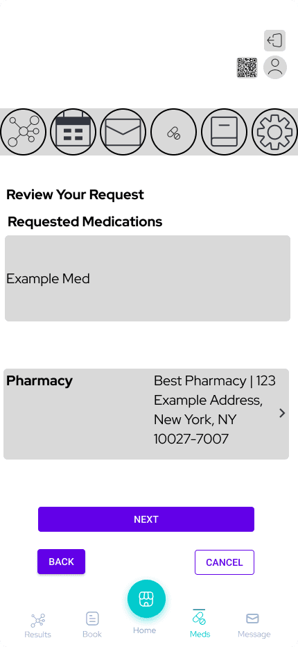
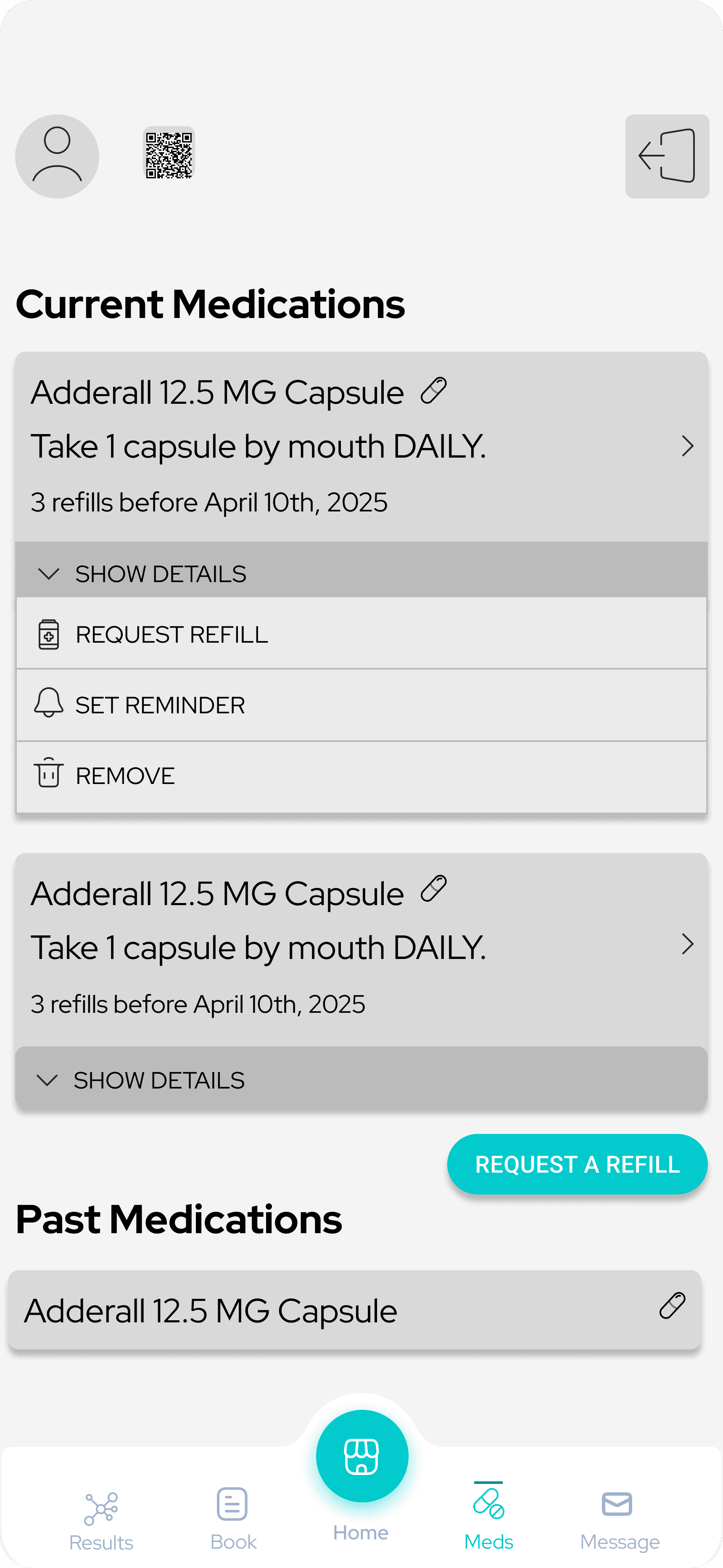
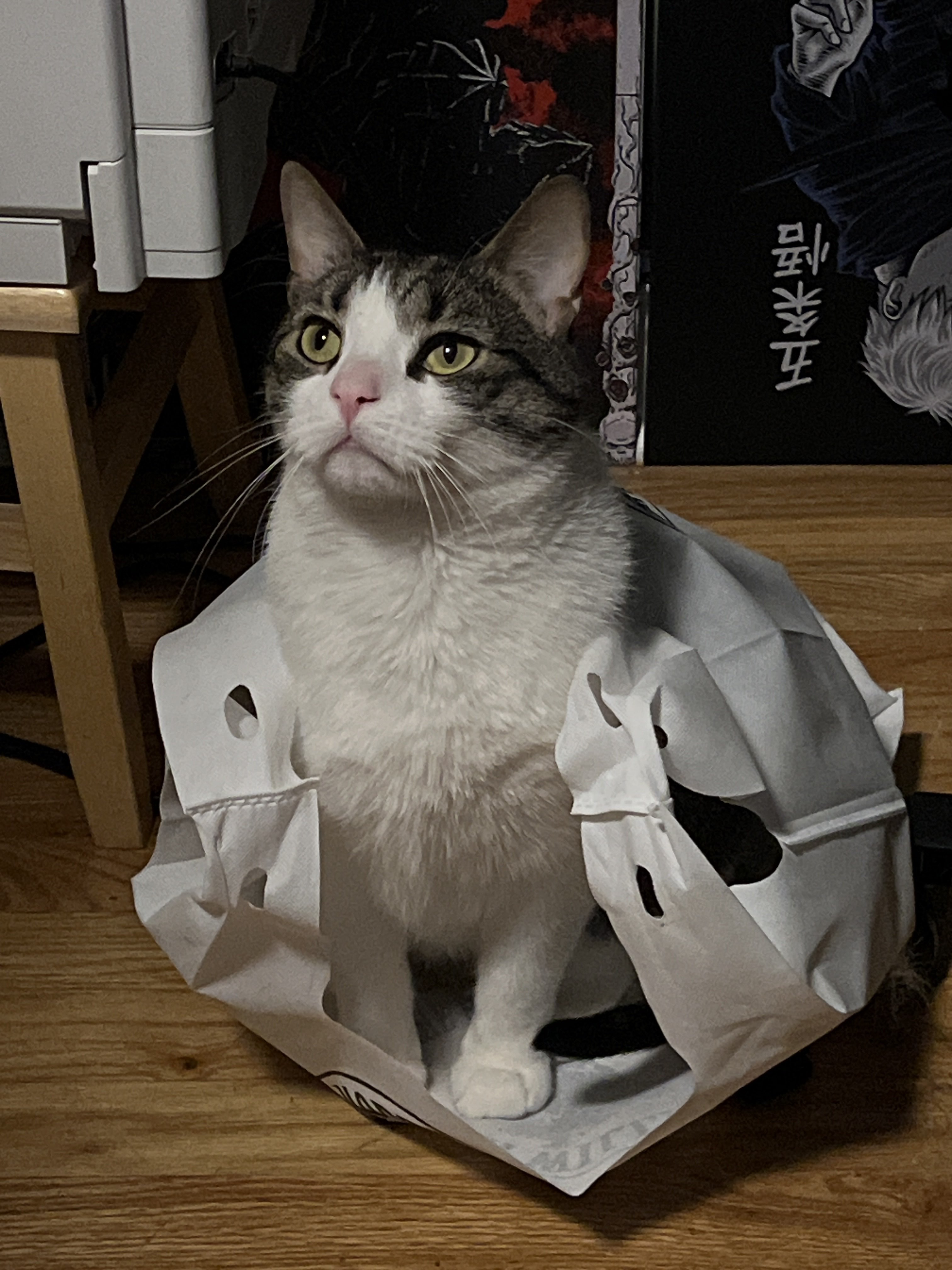
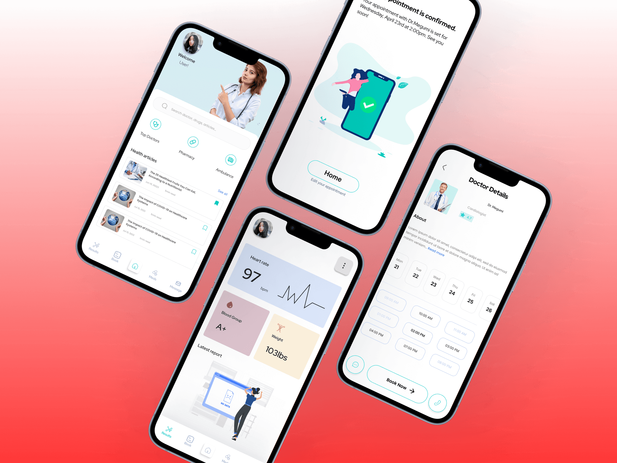
Once I addressed the usability concerns, I transitioned to crafting the ultimate screens in Figma. My aim was to fashion a visually captivating UI that struck a balance between aesthetic allure and intuitive simplicity.
The overarching style of the app exudes a sense of freshness, employing a light and clean aesthetic to enhance user enjoyment.
I adhered to the renowned principles of Material Design, tailoring the design primarily for mobile users operating within the iOS ecosystem.
Olive's Flow
Issue 03 - Participants perceived certain texts as too small.
Solution - Adjust all font sizes to be at least 12pt.
Issue 02 - Participants inadvertently removed a drug record while trying to modify the quantity
Solution - Implement a dialogue for users to confirm if they're sure they want to delete or add medications
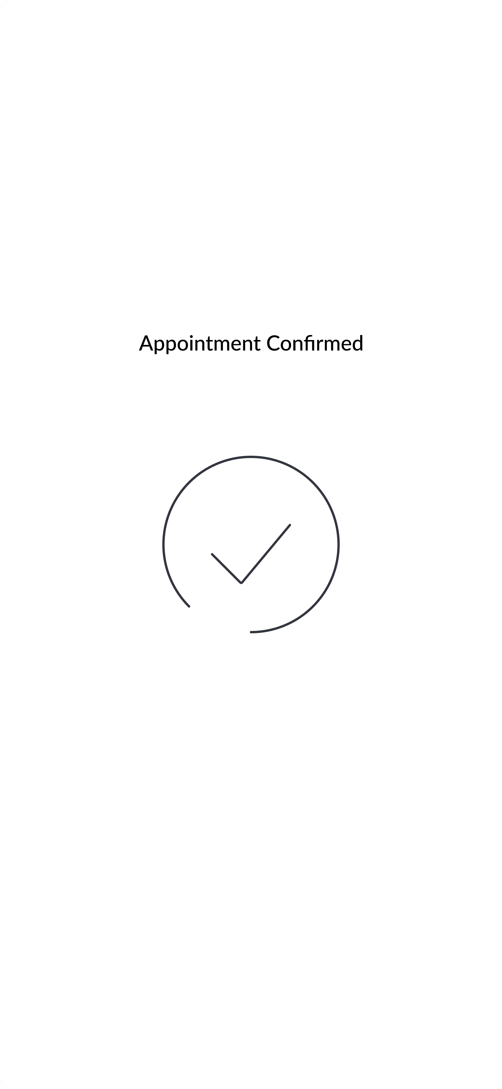
Issue 01 - Participants overlooked the affirmation post-appointment booking
Solution - Implement Clearer feedback prompts to address instances where users miss confirmation messages.
Usability Testing
I crafted a completely functional, high-definition model of the fresh processes using Figma. Simultaneously, we began enlisting participants who fulfilled our requirements for examination. During four efficiency assessments, we identified the subsequent complications:
User Flows
Log in / Sign up flow
User Registration
Profiles
Health Records Management
Appointment Booking
Language and Accessibility Options
User Journey for Megumi
Persona - Megumi
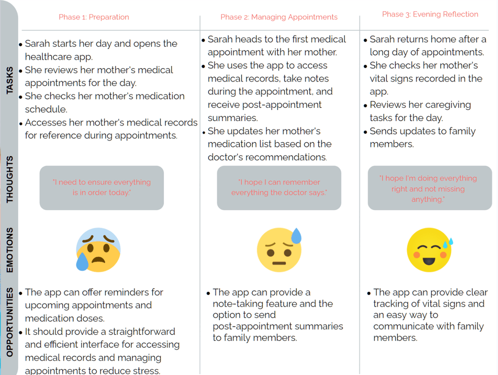
User Journey for Sarah
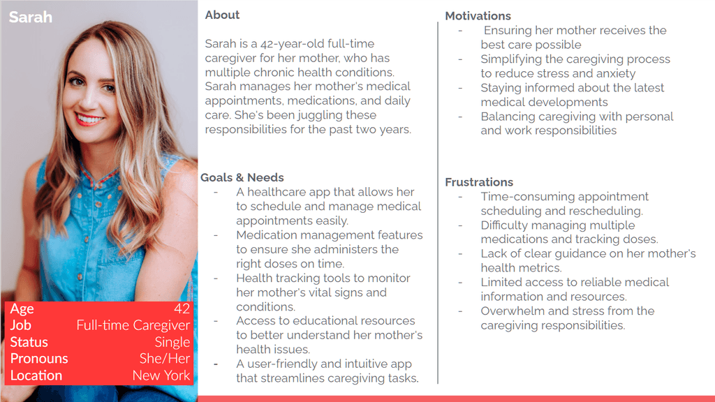
Persona - Sarah
Personas
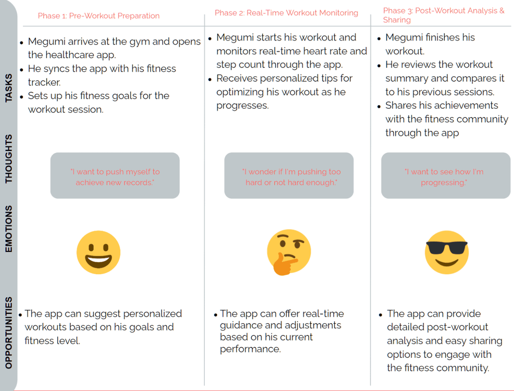
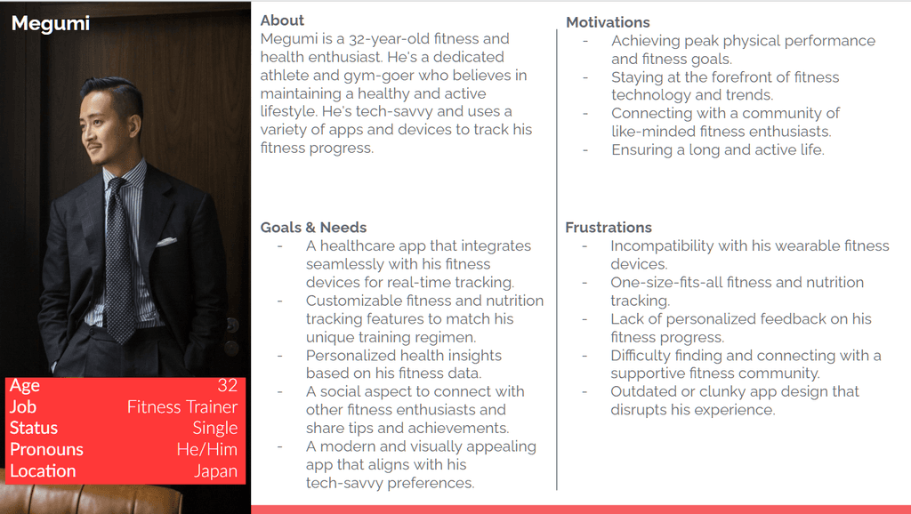
To gain a deeper understanding of our users' goals, needs, experiences, and behaviors, I developed two personas for each user segment. These personas were crafted based on insights gleaned from user interviews and surveys, and I continuously refined them throughout the project as I gathered more data. Whenever I needed to gain perspective outside of my own, I referred to these personas. I utilized a blend of qualitative and quantitative data from various sources to ensure the personas accurately reflected the needs, goals, and behaviors of our target audience. This approach facilitated the creation of more effective and user-centered app designs. For each persona, I meticulously outlined their goals, needs, motivations, and frustrations to provide comprehensive insights into their user journey.
Problem
Today's health sector is devoid of a thorough, user-focused digital access, leading to disjointed patient encounters, wasted paper, postponed availability of health data, and restricted choices for active health management, eventually blocking an effective supply of top-notch healthcare provisions.
Why create Olive?
Olive marked my journey through a bootcamp project in 2024, where I took on the roles of both UX and UI designer. As the UX designer, I undertook a range of responsibilities. These included crafting designs, sketches, and wireframes, conducting exhaustive research and analysis, developing prototypes, and applying the finishing touches to the UI. Additionally, I meticulously organized all design deliverables to facilitate a seamless transition for developers, should the app venture into real-world development.
MARCUSXGARCIA18@GMAIL
This will hide itself!
